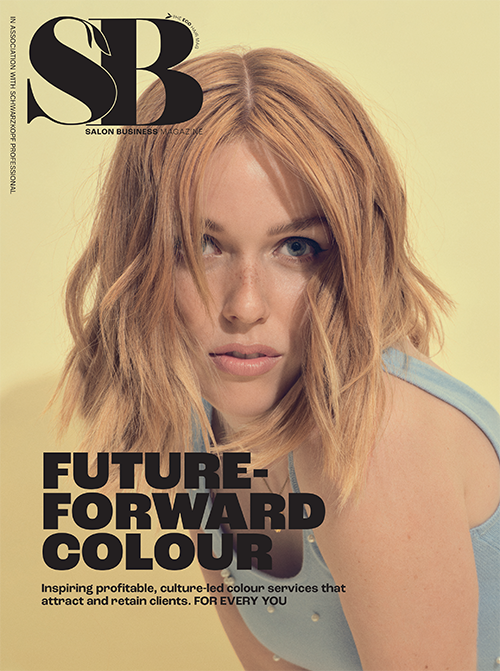
COMMUNICATING COLOUR

Trevor Sorbie Technical Education Director, John Spanton, shares his trend predictions for colour this spring/summer season.
This year I feel colour is going to be much more natural with a lot of earthy and muted tones coming through. It’s a look that’s lived in rather than technical perfection. Colour application will have a softer blend, transitioning from one colour into another with seamlessness. We will have a much more believable and more organic approach to colour, rather than your traditional highlights.

However we are finding a lot more 40 to 50-year-old women asking for more foil highlights as they want a brighter, more prominent blonde. The key to this look is not over toning the hair, so it doesn’t look overly natural. It’s about clever colour placement, so not quite balayage but just lightened ends, remembering not to over work the colour. You want to tone the hair enough to give a softness to the colour but with the rawness of the bleach coming through. It’s all about minimal but effective toning.
In contrast to this, instead of all over bold colours, we’ll also be seeing bolder pieces of colour sat within the hair. This trend is much more socially acceptable across a whole range of age groups, not just people in their early 20’s now. The beauty of this trend is the degree of primary colours can be varied and multiple shades can be used in panels or whole sections underneath the hair or as a whole block colour. With this colour, it’s important to know it’s not one technique that suits all. With the hidden panels, it entirely depends on the haircut, the colour application and technique will vary from a one length cut to a shorter bob. A lot of maintenance comes with this trend too so it’s important your client knows it’s a temporary colour and time and cost will go into retaining the colour.

Our latest collection Unified, showcase my colour predictions for this year. With this collection, we wanted to defy the word ‘trend’. Our choice to use green was before pantone announced it as colour of the year. We thought everyone is working with bright and bold colours so let’s do the opposite and create muted, earthy tones. We approached the collection with the idea of the ‘anti-beautiful’, making the wrong right or the bad beautiful. We defined the word ‘beauty’ and I think this is going to be seen a lot more this year in colour and cutting.